


How I turned a QR scan into a high-intent loyalty experience

Redesigning the customer-facing loyalty page so a customer sees their reward the moment they scan - and every brand partner can make the page look like theirs without breaking that.


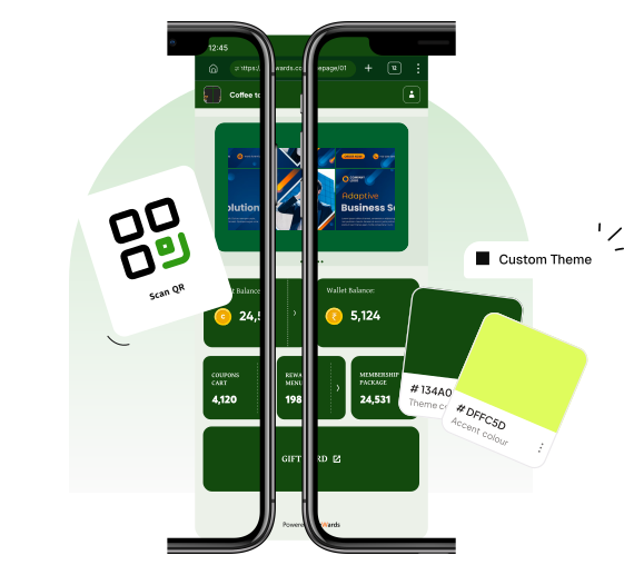
My role

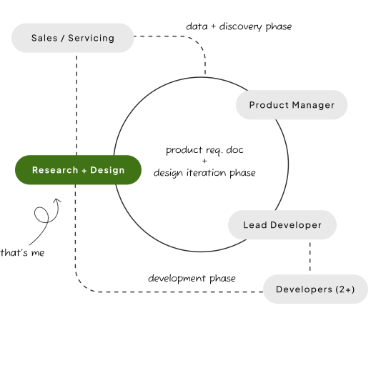
Sales/Servicing insight + PM + [ Research + Design ] + Engineering
Discovery
- Identified core problem areas with input from internal sales & servicing teams
- Reviewed anonymized drop-off analytics to validate what teams were reporting anecdotally
- Sat with the Product Manager and Lead Engineer to pressure-test every reported issue against feasibility and cost - separating what we could realistically fix now from what was out of scope for this phase.
Development
- Worked closely with the PM and Lead Developer through design iteration to keep decisions grounded in what was buildable, before two additional developers joined to build the app from scratch once design was finalized.
- Validated the modular layout concept before high-fidelity, using low-fi wireframes across every page state.
- Handed off the locked-points-block rule and the brand-configurable component logic as explicit constraints, not just visual guidelines - so the build team had no ambiguity on what was and wasn't editable by brands
Setting some context, before we begin…
What is the OnePage Website?
The One Page Website is the customer-facing end of eWards' loyalty stack — a QR-triggered micro web app.
A customer scans a code at checkout and lands directly on their points, rewards, coupons, membership details and brand promotions and info. No app download, no account creation.
INSTA POST
SPECIAL
PROMO
BUY 1 GET 1 FREE
Credit Balance:
C24,531
›Wallet Balance:
₹5,124
›COUPONS CART
4,120
›REWARDS MENU
198
›MEMBERSHIP PACKAGE
24,531
›Powered by eWards
INSTA POST
SPECIAL
PROMO
BUY 1 GET 1 FREE
Credit Balance:
C24,531
›Wallet Balance:
₹5,124
›COUPONS CART
4,120
›REWARDS MENU
198
›MEMBERSHIP PACKAGE
24,531
›Powered by eWards
One Page Website = Instant Access + Brand Trust
Scan QR, get instant access
brand customize app
Why redesign was required?
(from both business & user point of view)
The old experience, in detail
| Dimension | Old | New |
|---|---|---|
| Layout | Fixed, same for every brand | Modular, brand-reorderable |
| Points visibility | Buried | Locked to top third |
| Brand control | - | Colors, banners, fonts, section order |
| Promotions | - | Ad banners for offers and seasonal campaigns |
| Brand details | - | Online presence, store and office addresses, updated contacts |
| Transaction history | - | Full history across points, credits and wallet |
| Membership | - | Membership details plus purchase and renewal history |
What we heard, before we began…
The two boards above came out of interviews with internal sales & servicing teams - the people fielding this feedback directly from brand partners - cross-checked against a review of anonymized drop-off analytics, so each point is something more than one source raised.
Ranked by how many independent sources raised each theme across sales & servicing interviews, drop-off analytics and direct brand requests - not by support-ticket volume, which wasn't tracked for this product.
Service blueprint - before & after
Mapping the counter moment across the customer, the staff serving them, and the system behind it.
Before - the customer does the work
Six customer-side steps, two of which are recovery: asking the cashier what to tap, then giving up. The wait marker sits where the page loaded but gave nothing back.
Customer Journey
Front Line Staff
Backstage Staff
Support Processes
After - the page does the work
Four steps, none of them recovery. The balance arrives before the customer has to look for it, so the cashier is no longer part of the interface.
Customer Journey
Front Line Staff
Backstage Staff
Support Processes
Both blueprints are reconstructed from the sales & servicing interviews and the drop-off review described above - they map the flow as those sources described it, not a separately observed session study.
The initial brief
How might we simplify the loyalty page experience to reduce drop-off and increase reward engagement, while giving brands control over how it's presented?
- and make the page something brands actually want to put in front of customers
Affinity mapping
Processing customer verbatim to understand user needs better.
“I scanned the code, but the page looked too long and confusing. I didn't want to spend time figuring it out in front of the cashier.”
Radhika Sen, customer
“I don't want to download anything. Just show me my points while I'm billing.”
Radhika Sen, customer
“Sometimes I just want to see what kind of perks the brand offers later. But if it looks outdated or boring, I won't bother.”
Farhan Ali, customer
“I want to see my points first. And maybe a button that tells me what to do next. I don't want to search.”
Priya Mukherjee, customer
“We wanted to promote a seasonal offer, but couldn't highlight it well. It just blended into the old design.”
Ankit Sharma, brand partner
“I had no way to move the services section up - it was always last. We want people to know we offer more than massages.”
Deepa Rao, brand partner
With that, the brief was defined as…
Initial problem statement
How might we make the loyalty page easier to use for customers?
Final problem statement
How might we let every brand make this page feel like theirs, while guaranteeing every customer understands their reward in under 5 seconds - even when a brand customizes it badly?
Benchmarking study & opportunities
| Product | Strength | Weakness |
|---|---|---|
| Belly Loyalty | Full app experience, gamification | Complex, not ideal for small brands |
| Zoho Loyalty | Rich CRM integration | Setup-heavy, overkill for quick use |
| Stamp Me | Simple app-based loyalty | Requires app download |
| One Page Website (eWards) | Fast, app-less, mobile-first, fully brandable | Limited to loyalty display, no deep features |
MUST
Non-negotiable
- 1.Points/rewards visible without scrolling
- 2.App-less, instant access
- 3.Mobile-responsive by default
DECIDE
Open trade-off
- 1.How much layout control to give brands - full freedom vs. a constrained system
- 2.Whether the points block's position is locked or brand-configurable
Comparing our options here…
Option 1
Fully open layout
Brand controls every section, including points position
- + Straightforward for brands to understand
- − Risk: a brand could bury their own points display under promo banners, recreating the original problem
Option 2 - shipped
Locked points block, flexible everything else
- + Guarantees the 5-second clarity goal regardless of brand behavior
- − Slightly less “total” flexibility, but removes the failure mode of Option 1
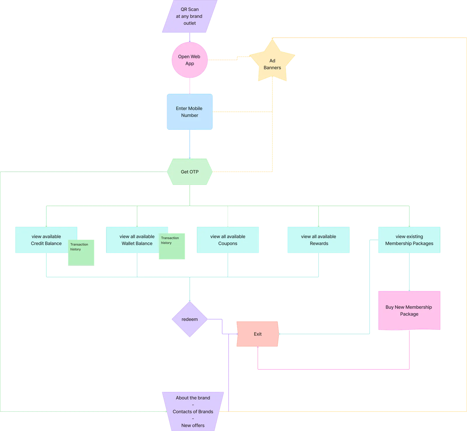
User navigation flow
Design process
Two stages: validating the modular layout concept with low-fidelity wireframes across every page state, then moving to high-fidelity once the locked-points-block rule and brand-configurable component logic were settled as explicit constraints for the build team.
Design solutions
Each screen annotated where the decision actually shows - arrows point at the pixel, not the paragraph.
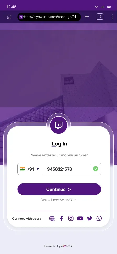
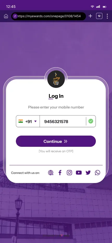
Login & promos
- One mobile number gets a customer in - no account to create, nothing to download.
- The promo banner sits above the fold, so a brand's current campaign is the first thing seen.
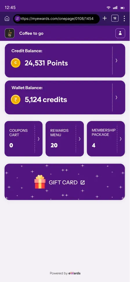
Points at a glance
- The balance lands in the top third on arrival - locked there by rule, not by brand preference.
- Credit and wallet share one card shape; only the label and unit change, so there's one thing to learn.
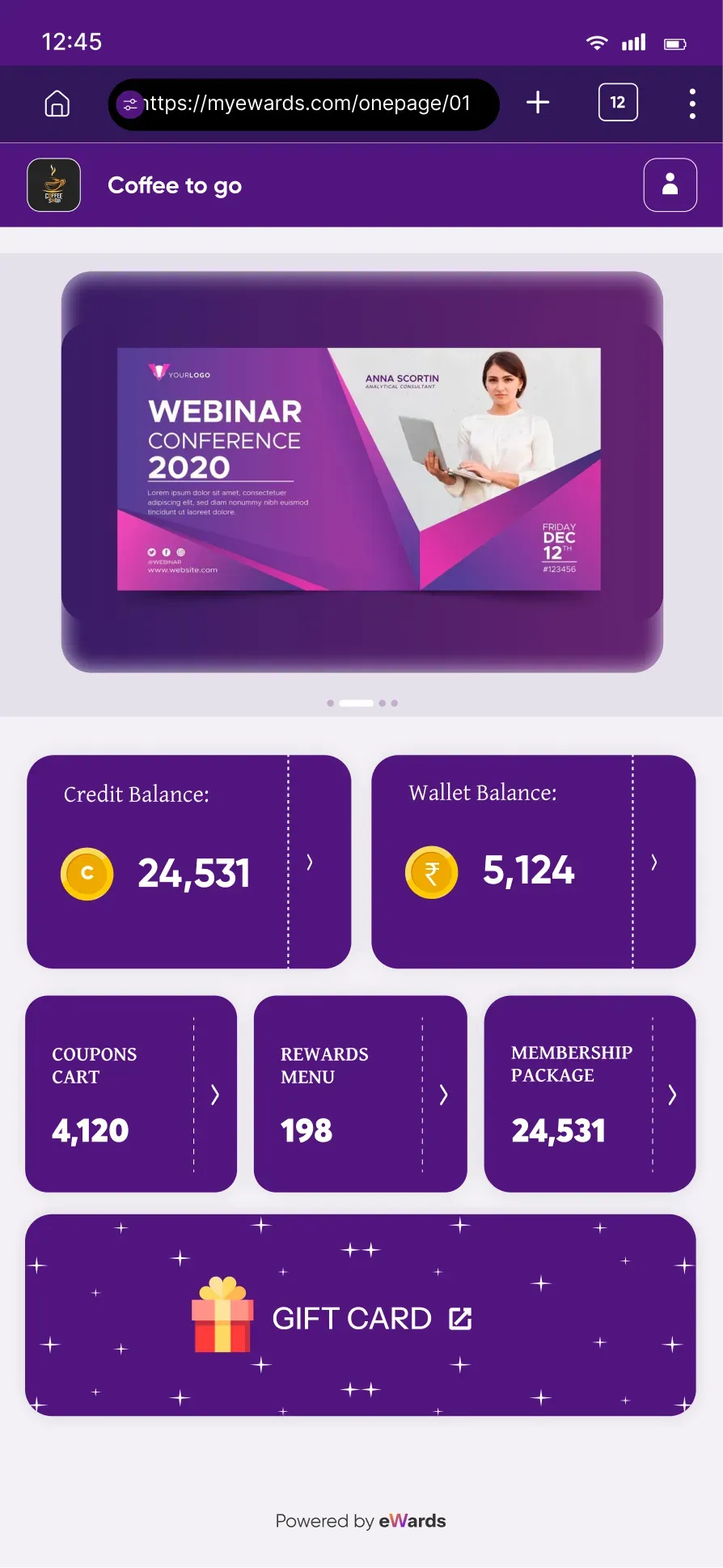
Modular overview
- Brands reorder these blocks freely to put their own priorities first.
- The points block is the single exception they cannot move - the constraint that makes the freedom safe.
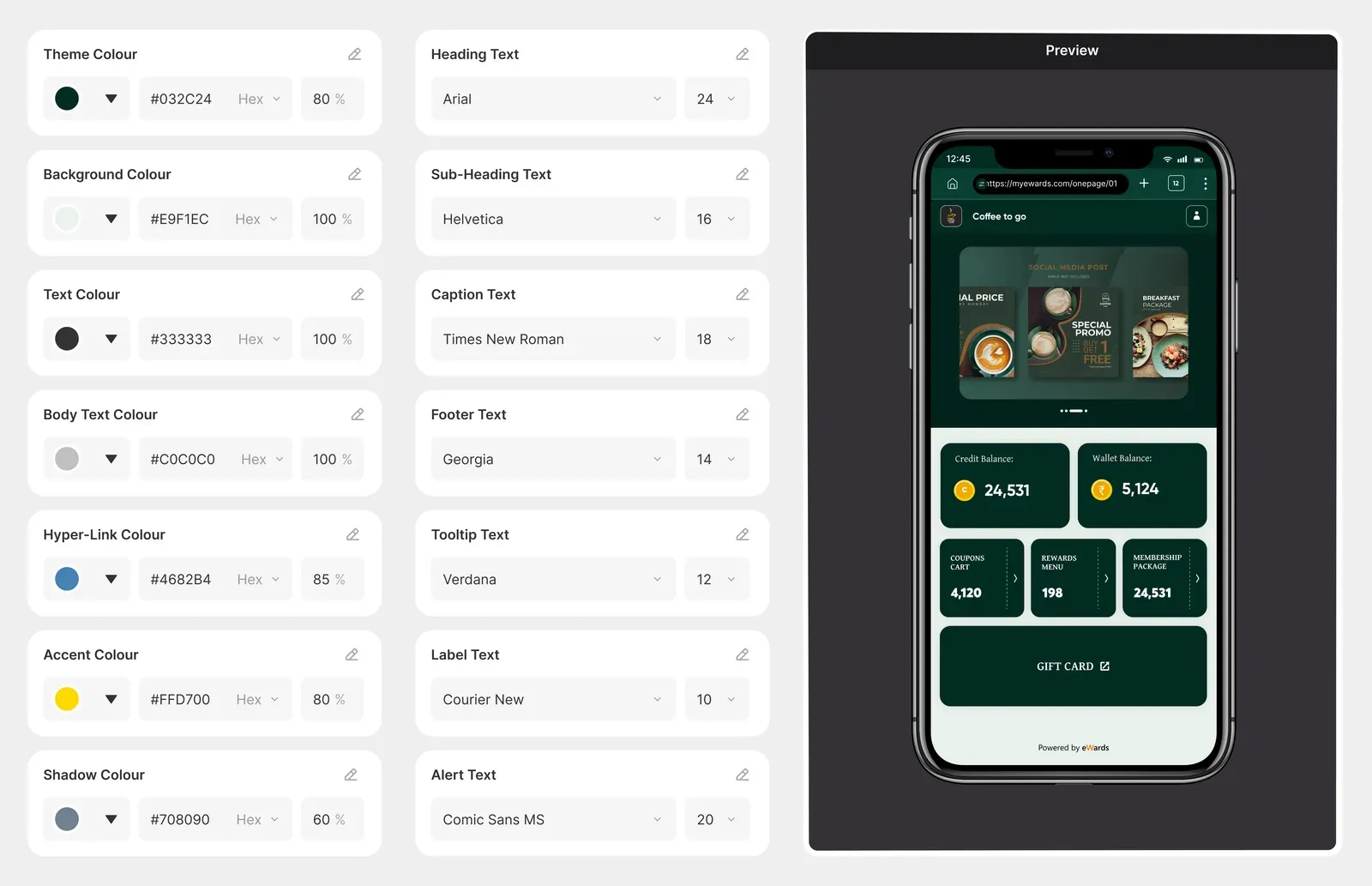
Brand theming
- Colour and type are configured per brand, with a live preview beside the controls.
- Same components underneath - the identity changes, the layout logic doesn't.
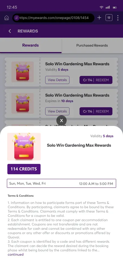
Offers, organised
- Coupons stay findable when a brand has dozens live, not three.
- Filters sit within thumb reach - the page is used one-handed, at a counter.
Brand visibility
- Up to six social links, reachable without logging in - the page works as a brand surface, not just a wallet.
User persona

Radhika Sen
- Age:
- 33
- Occupation:
- Corporate Professional
- Tech Comfort:
- Moderate
- Motivation:
- Use loyalty rewards instantly at checkout
Needs
- • Fast, mobile-friendly access
- • Clarity on points and rewards
- • Ability to use coupons instantly
Interview snippet
“I scanned the code, but the page looked too long and confusing. I didn’t want to spend time figuring it out in front of the cashier.”
“I don’t want to download anything. Just show me my points while I’m billing.”
Pain Point: Overwhelming layout
Design Insight: Reduce visual noise and bring rewards forward

Farhan Ali
- Age:
- 21
- Occupation:
- Student
- Tech Comfort:
- High
- Motivation:
- See brand offers and rewards out of curiosity
Needs
- • Access even after leaving the store
- • Clear info on what services are offered
- • Modern look and feel
Interview snippet
“Sometimes I just want to see what kind of perks the brand offers later. But if it looks outdated or boring, I won’t bother.”
“I like checking for new deals even when I’m not buying anything.”
Pain Point: Low visual appeal, lack of retention cues
Design Insight: Create a modern, branded aesthetic with quick access to services

Priya Mukherjee
- Age:
- 45
- Occupation:
- Boutique owner
- Tech Comfort:
- Low
- Motivation:
- Track and redeem accumulated loyalty points
Needs
- • Simple instructions
- • Visible point balance
- • Easy-to-use CTA buttons
Interview snippet
“I’ve collected a lot of points, but I never remember how to use them.”
“I want to see my points first. And maybe a button that tells me what to do next. I don’t want to search.”
Pain Point: Confusing reward redemption flow
Design Insight: Prioritize points display and clear CTAs for next steps.

Ankit Sharma
- Age:
- 38
- Role:
- Marketing Lead, Mid-sized Retail Chain
- Goals:
- Increase loyalty program participation and brand recall
Frustrations
- • No visual control over previous designs
- • The layout didn’t match the brand tone
- • Low customer usage data
Needs from the web app
- • Ability to customize colors, banners, and CTAs
- • Trackable interaction points (like coupon clicks)
- • Cleaner hierarchy of content
Interview snippet
“We wanted to promote a seasonal offer, but couldn’t highlight it well. It just blended into the old design.”
“We want customers to feel like they’re on our website, even if it’s just a page.”
Design Insight: Allow hero banners and customizable section priority to highlight key offers.

Deepa Rao
- Age:
- 50
- Role:
- Spa Franchise Owner (Wellness Sector)
- Goals:
- Educate customers about additional services and drive walk-ins
Frustrations
- • About section is often ignored
- • Couldn’t reorder content to promote services
- • Design didn’t align with premium brand tone
Needs from the web app
- • Custom brand identity (colors, logos, banners)
- • Rearranged layout to put services higher
- • Premium look without extra development
Interview snippet
“I had no way to move the services section up - it was always last. We want people to know we offer more than massages.”
“If customers knew we offered skincare packages, more of them would visit.”
Design Insight: Design flexible section ordering and ensure visual polish across layouts.
Re-design
Impact
- 0%
- Increase in customer engagement with loyalty programs through easier navigation.
- 0%
- Faster login and access due to simplified one-page layout.
- 0%
- Higher click-through rate on rewards and offers after redesign.
- 0+
- Brands adopted the new design within 2 months of relaunch.
Reflection & learnings
Flexible systems need one non-negotiable rule - without the locked points block, brand freedom would have recreated the exact problem the redesign set out to fix.
Modular thinking helped build scalability into a micro-product, not just this one release.
Internal team feedback was crucial in catching content edge cases before they reached brand partners.
Next steps - future scope
With more engineering bandwidth: per-brand layout performance instrumentation, so brands can see which section order and theme choices actually move engagement, instead of configuring blind.
Designed for trust, flexibility, and performance - built once, but works for all.
- THE END -
More case studies
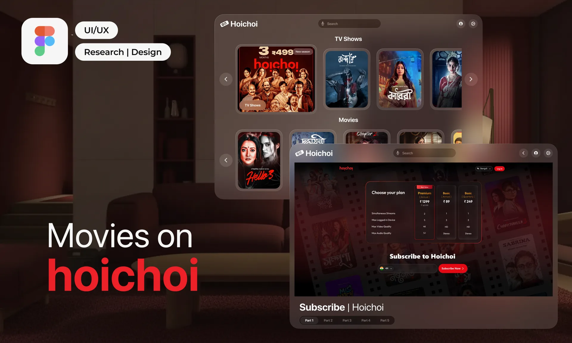
hoichoi, Rethought
Improving discovery, clarity and decision-making across the OTT subscription journey.
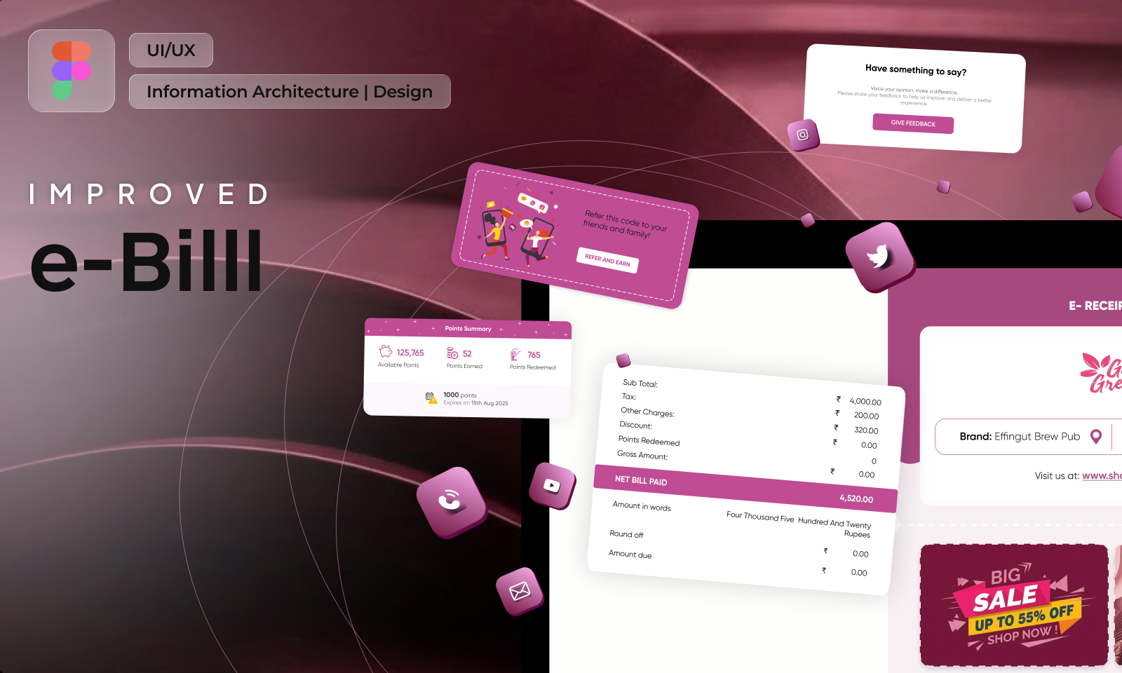
e-Bill, Improved
A tax document rebuilt into the post-purchase screen brands actually wanted to own.
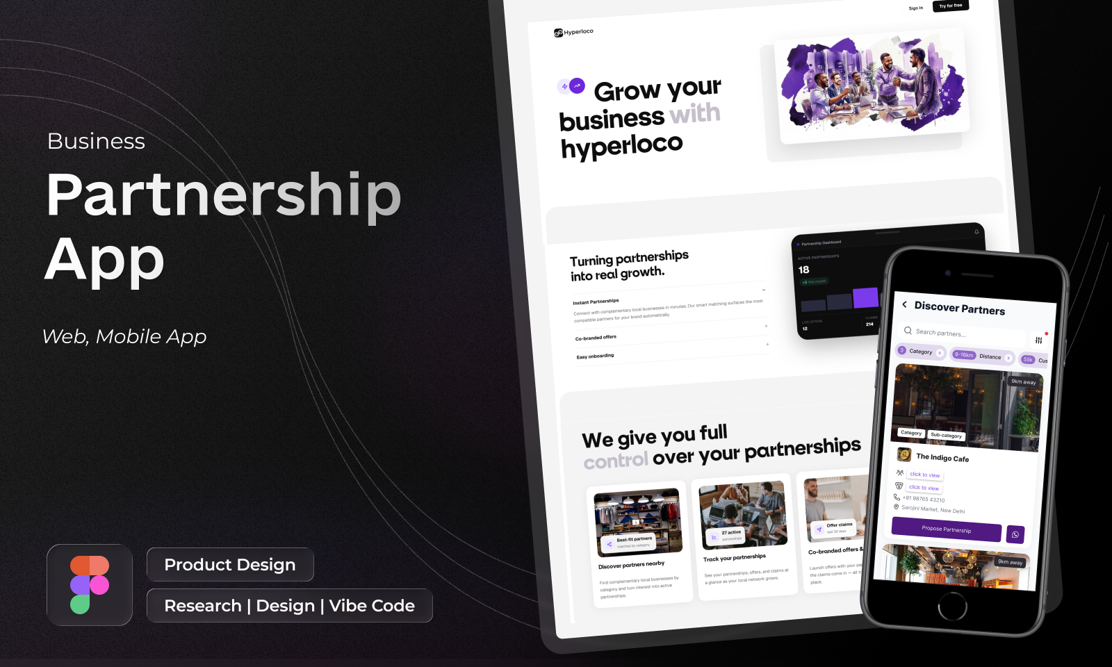
Hyperlocal Network
Neighbourhood businesses trading customers with each other, designed for a cold start.
The eWards Design Guide
One vocabulary for colour, type, space and state - shared across Vue and Flutter.