eWards e-Bill
Rebuilding a tax document into a post-purchase surface
Giving every brand a receipt worth owning, without asking any of them to design one
eWards is a loyalty platform wired into the point-of-sale of retail and F&B brands. Every time a transaction closes it issues a digital receipt - the e-bill - delivered by SMS, WhatsApp or a QR code at the counter. It is the highest-traffic screen in the whole product, and when I picked it up, not a single client had switched it on.
Client
Timeline
Product type
Status
My role
Sole designer on the product. I owned the research, the information architecture, the theming system and the handoff, working with the sales and servicing teams who fielded the objection, a PM, and a lead engineer who mapped the POS payload with me before I drew anything.
The work that mattered most was not drawing the document. It was deciding what the document was allowed to be, and writing those rules down in a form a build team and a sales team could both use.
The problem
The e-bill returned nothing to the business paying for it - no identity, no retention, no route back to the store - while still being the one screen every customer opens. Brands did not complain about it. They simply never turned it on.
The solution
A receipt built as independent blocks: 56 POS fields per line collapsed to six columns with the rest one tap away, loyalty promoted to its own card, and a four-role colour system with a live preview - so any client can reorder, retheme and switch the document down to the field without a designer.
Leading the design process
Five weeks from first sales debrief to handoff, run alongside a build team that was already shipping. The order mattered: I started with why the product had been refused, not with how it looked.
Six roles, one document
Reads it. Customer, franchise auditor - the two people the document has to serve at once.
Operates it. Sales configures the account; the PM sets what ships by default; I designed the rules both work inside.
Feeds it. The POS pushes the raw 56-field payload the whole system is built to collapse.
Discovery
2 wks- Read the lost-deal notes before talking to any user
- Interviews with sales and servicing
- Line-by-line audit against a real POS payload
Definition
1 wk- Rewrote the brief around the brand, not the customer
- Named the two readers the document serves
- Agreed the non-negotiables with PM and engineering
Architecture
2 wks- Mapped the 56-field POS payload with the lead engineer
- Designed the per-row disclosure model
- Set the default configuration
Design & iteration
3 wks- Built the four-role theming contract
- Designed every block to survive its neighbours being removed
- Internal review with servicing and QA
Handoff
1 wk- Shipped rules rather than redlines
- Stayed through two developer onboardings
Understanding why nobody switched it on
The research did not start with customers, because customers were not the blocker - every transaction generates a bill and people open it. The blocker was the brand, so I went where the objection lived: sales debriefs, servicing calls, and demos where the client stopped asking questions.
What the room kept saying
Nothing in it for the brand
- “They ask what it does for them. I don't have an answer that isn't “it's a bill”.”
- “We already print a bill. Why would I pay for a second one?”
Two internal readers who disagree
- “The franchise ops head wants every field on it. The marketing head wants none of them.”
- “If my format is off it might get flagged, and that delays the claim.”
Opened once, then never again
- “My customers open it once. I need them to open it twice.”
- “I only opened it to check the total. I didn't know I had points until the cashier told me.”
Category research
- Every loyalty platform in the category issues a digital receipt; almost none treat it as a surface worth designing.
- Receipts are held to legal and insurance-adjacent standards, so nothing can simply be deleted to make room.
- Brands in different categories have genuinely different obligations - a restaurant's fields are not a jeweller's.
Key insight
The customer was never refusing to read the bill. The brand was refusing to send it - so the design problem was not legibility, it was making the document worth owning.

Every printed bill ends up here - torn off, glanced at once, never opened again.
That is the object the redesign had to out-argue.
Counting what the old bill actually printed
Before proposing anything I rebuilt the live document against a real POS payload and counted what it was printing. Not impressions - counts, because a redesign argued from taste loses to whoever in the room has more seniority.
14 fields printed as “NA”
Section, Table, Server, Service, Channel, GSTIN, PAN, Store Name, Delivery Address, City, Pincode, Landmark and two more. A restaurant's bill printed a delivery address; a retail bill printed a table number.
7 columns across 375px
Product names wrapped to three lines, and the columns a customer actually reads got the least width on the row.
5 legal clauses, permanently expanded
Roughly a fifth of the document's height, sitting above the only things on the page a customer could act on.
1 mention of loyalty
“Points Redeemed 100”, a row inside the tax block. The company's entire product category, formatted as an accounting adjustment.
11 tap targets for feedback
A 0–10 NPS row at roughly 30px each - under the 44px minimum - unlabelled between the two ends.
0 things to do
No share, no download, no route to the store, no way to spend a point.
One document, two readers
POS system
56 fields per line
The customer
≈ 8 seconds · at the counter
- What did I pay?
- What did I earn?
- What can I do now?
The franchise auditor
a month later · at a desk
- Every field the POS sent
- Tax, HSN, discount trail
- Line-by-line, exportable
Opportunity
Progressive disclosure is the only structure that serves both of them without building two products.
Collapsing 56 fields into six columns
The mapping session that settled the whole document. For every single line on a bill the POS pushes 56 fields - four groups of them, none optional, all of them real to somebody. The old design's answer was to print as many as would fit and truncate the rest.
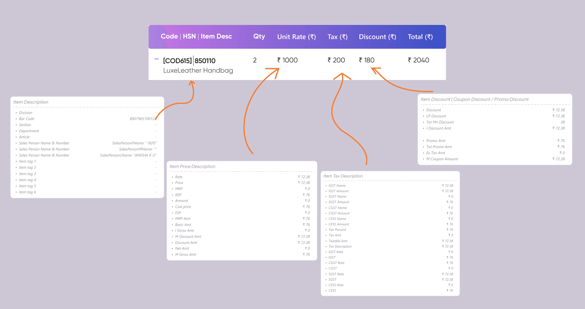
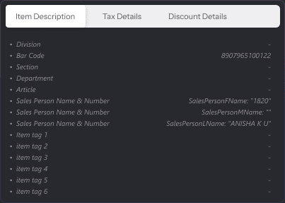
Tapping a row opens that item's full payload - the whole 56, grouped as description, price, tax and discounts - in the same document, without a route change. The auditor loses nothing. The customer never has to know it is there.
The trade
Two taps for an auditor who used to see everything at once, and a mapping session per POS integration, because every POS names these fields differently.
Four colour roles, and a document clients can rebuild
Every brand wanted the receipt to look like theirs. Almost none had a designer, and sales could not wait on us to theme each account. So colour is exposed as four named roles - theme, accent, background, text - each taking a hex and an opacity, beside a live preview.
Hue
Preview
Livescroll to see the rest of the document
A role is a decision a shop owner can actually make. “Table header fill” is not. The preview is the real guardrail- cheaper than any validation rule, and the reason nobody shipped a receipt they hadn't looked at.
Same build, five configurations
Then they asked for layout
A jewellery retailer and a biryani chain do not want the same document. So every section can be dragged into a different position or switched off entirely, and inside the bill blocks every individual field is a toggle too.
A jewellery retailer
Coupons matter; referral doesn't. Banners stay above the tear.
A quick-service chain
No customer block, no coupons, referral on, banners after the total.
Same product, same build. Drag to reorder, switch to remove - and the document has to read correctly in every arrangement, including the ones nobody reviewed.
Bill details
6/12 onCustomer details
3/12 onItem row
6/12 onWhat that changed about the design job
- Every section is self-contained, with its own header and colour treatment, so it reads the same whether it lands second or ninth.
- No section refers to another. Nothing says “as shown above”, so any block can be missing.
- Every block collapses gracefully: remove all its fields and the block disappears with its header, rather than leaving a titled empty box.
- Spacing lives on the blocks, not between them - otherwise removing one section leaves a double gap and the document looks broken rather than configured.
- The default configuration is the opinionated one, and it is what every account starts from.
The trade
A client can absolutely configure a worse receipt than the one I designed, and some have. I traded control for reach - the only things between a client and a bad document are the default, the preview, and the fact that no block depends on another.
A document that behaves like the object it replaces
The finished receipt keeps the physical grammar of the thing it stands in for. A perforation separates the brand's half from the transaction's half; the bottom edge is torn rather than cut. It costs the reader nothing to parse, because they have learnt it from ten thousand paper receipts.
Loyalty stops being a line item
Points were the commercial point of the platform and had one row on its most-opened screen. Now they have their own block in the brand's colour, placed immediately after the amount paid, withan expiry nudge that is the reason a receipt gets opened a second time.
Eleven feedback targets became five
The old instrument was a 0–10 NPS row: eleven targets at roughly 30px on a 375px screen, unlabelled between the two ends. It returned almost nothing.
0–10 NPS row
11 targets · ~30px each · 2 labels
under the 44px minimum
Five-point scale
5 targets · ~68px each · all labelled
meets the 44px minimum
Rate us
Your feedback helps this store serve you better.
Shipping rules instead of redlines
Two developers joined once the design was settled and built the front end from scratch. What they needed was not a redline file - it was the set of rules that would keep the document correct on the four hundredth account, configured by someone I would never meet.
Field-visibility rule
Render a field only when the POS returns a non-empty value. No placeholders, no “NA” - and a section header disappears with its contents.
Theming contract
Four named colour roles, and the map from each role to every surface it reaches, so a component built after I left knows which role it belongs to.
Default configuration
The section order and toggle state every new account starts on, shipped as data rather than as a recommendation.
Block independence rules
No cross-section references, spacing owned by the block above, empty blocks removing their own headers.
Accepted by 98% of brand partners
Partner acceptance
At proposal, against a version nobody switched on
Fewer fields shown by default
56 collapsed to 6, none of them lost
Fewer feedback targets
11 unlabelled boxes down to 5, all named
Accepted as the new default
98% of brand partners took the redesigned e-bill at proposal, against a previous version no client had switched on.
Opened the room instead of losing it
32 new clients in 4 months across QSR, retail and F&B, with the e-bill no longer the objection that stalled the deal.
Configurable without a designer
Colour, section order and field visibility all move without a design ticket, so onboarding an account takes an afternoon.
An honest note
These are sales-attributed figures. The e-bill is one line in a platform deal and no brand signs for a receipt alone - what changed is that it stopped being the thing that lost the room. Removing an objection, not creating demand.
What I would carry forward
A product can fail without a single complaint
Nobody filed a bug against the old e-bill - they simply never switched it on. I now treat “no feedback and no adoption” as the loudest signal a product can give, and I go looking for it in sales notes rather than waiting for it in a research round.
Compliance is a layout problem, not a content problem
Everyone assumed the legal fields were why the document was unreadable. They weren't. The fields were fine; the decision to print all of them at once was the design.
I argued for less configurability than the product needed
My instinct, carried over from a loyalty page where locking one block was right, was to weld the order in place. A receipt is issued by businesses with different legal obligations and different fields. The useful half of that instinct survived as the default, not as a rule.
What I'd do differently
I designed the customer's document first and retro-fitted the auditor's view into a disclosure. It works, but the drill-down still reads like an afterthought - 56 rows with no hierarchy of their own.
- The end -
More case studies
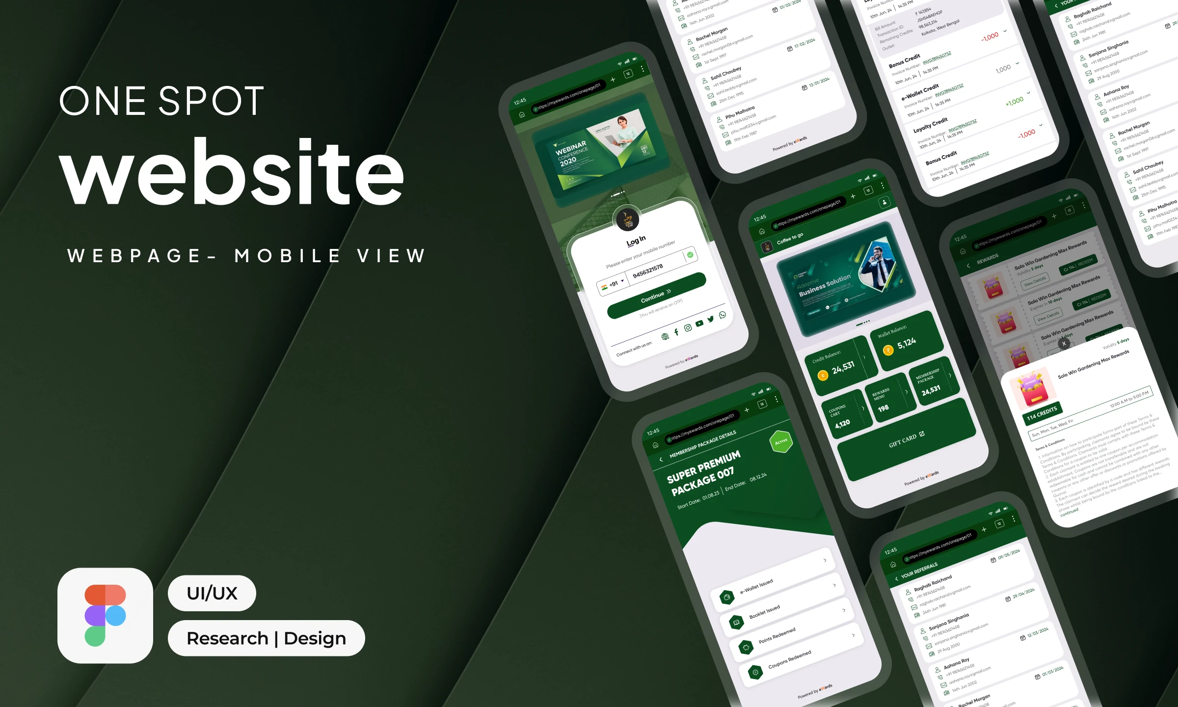
One-Spot Web App
A lightweight, brand-adaptive mobile web experience for loyalty, rewards and engagement.

hoichoi, Rethought
Improving discovery, clarity and decision-making across the OTT subscription journey.

Hyperlocal Network
Neighbourhood businesses trading customers with each other, designed for a cold start.
The eWards Design Guide
One vocabulary for colour, type, space and state - shared across Vue and Flutter.