DESIGN SYSTEM · 2026 · KOLKATA, INDIA
The eWards Design Guide
One brand had three different indigos. This is how I turned a 2,600-line stylesheet and a pile of ad-hoc values into one documented token set two codebases could actually share.
Context
The product
HyperLoco is eWards’ cross-merchant partnership network - independent businesses find each other, agree partnerships, publish joint offers, and track what those offers bring back. It ships as a Vue web app for merchants and a Flutter app on mobile, across nineteen feature modules.
19
Feature modules
9
Spacing steps
8
Type roles
7
Status states
Drift
The problem: drift
Nothing here was built carelessly - it was built fast, twice, by people solving real problems. But two design systems had grown up side by side in one repo, and a third lived in the Flutter app. The clearest symptom: ask what the brand indigo is, and you get three answers.
#4338CA
Legacy web + Flutter
The original, documented indigo
#2B2385
v2 primary token
Declared as the new primary action colour
#6A5CF2
v2 live skin
What actually renders - a later :root wins
01
Three :root blocks
One stylesheet redefined the same custom properties three times. The last one silently won - so the documented token and the rendered colour disagreed.
02
A retrofit skin
Rather than components consuming tokens, a parent selector re-skinned raw utility classes with !important. Every new screen inherited the override.
03
Ad-hoc spacing
6, 7, 9, 10, 14, 18, 22, 33 - spacing values chosen per screen. Nothing lined up across screens because nothing was agreeing on a base unit.
Palette
Colour, with a budget
The rule came first, the palette second: 70% neutral, 20% brand tints, 10% brand accent. A budget makes the decision for you at 2am - if the screen is already spending its 10%, the next thing you’re about to make indigo shouldn’t be.
Neutral
Canvas, surfaces, borders
Brand tints
Chips, badges, active nav
Brand accent
Actions, links, emphasis
BRAND RAMP
--indigo-50
#F6F3FC · Hover bg, nav active
--indigo-100
#E9E4F7 · Badge bg, chip fills
--indigo-200
#D6CEEF · Badge borders, icon bg
--violet
#7C3AED · Secondary action
--indigo
#4338CA · Primary action
--indigo-hover
#362DA3 · Hover
--indigo-active
#2B2385 · Pressed
INK - WITH THE RATIO WRITTEN DOWN
5.1:1
--text-1
Body & headings
5.4:1
--text-2
Secondary copy
3.2:1
--text-3
Large text only
Each text token carries its measured contrast ratio in the token file itself. --text-3is annotated “large text only” - it fails AA at body size, and saying so in the code is what stops it being used there.
Surfaces
Cards, without leaning on outlines or shadows
Outlined and elevated cover most surfaces - but a third option, Flat, earns its place wherever layout already does the work of separating one card from the next.
Partnership request
Green Leaf Cafe wants to trade offers with you.
Outlined
1px border · no shadowThe workhorse. Cheap to render in dense lists where every row is a card.
Partnership request
Green Leaf Cafe wants to trade offers with you.
Elevated
shadow only · no borderFor anything that should feel liftable - a draggable item, a popover.
Partnership request
Green Leaf Cafe wants to trade offers with you.
Flat
no border · no shadowJust a tinted fill. The calmest surface in the system - reach for it once hierarchy is already clear from spacing.
State
A vocabulary for state
Partnerships move through a lot of states, and the backend spelled them more ways than the UI should care about. Seven states, one visual language - every foreground/background pair clears 4.5:1, and the two terminal states drop their fill entirely so they recede.
active · live · accepted
pending · proposed
negotiating · agreed
paused · suspended
ended · expired
declined · rejected
draft
“An unrecognised state must not look like a designed one.”
Anything the UI doesn’t recognise falls through to Paused grey - deliberately never brand indigo. A state nobody designed shouldn’t get to borrow the authority of one that was.
Feedback
Notifications, without shouting
Toasts are flat by design - no border, no shadow, just a tinted fill, so a confirmation reads as calm rather than urgent. Banners and badges pick up the same three tones: success, brand, and error.
Partnership accepted
Green Leaf Cafe is now a partner.
Offer published
Live for the next 14 days.
Couldn't publish offer
Check the redemption limit and try again.
INLINE BANNER
Weekly digest paused. No merchants matched your radius this week.
UNREAD BADGE
Unread counts stay red, never brand indigo - a badge is an interrupt, not a highlight.
Type
Two faces, eight roles
A display face for headings, Geist for absolutely everything else - and the split enforced in the stylesheet rather than left to judgement. Sizes live as eight named roles: no literal font sizes in feature code, so a size that isn’t in the scale becomes a design conversation instead of a one-off override.
One honest footnote that stayed in the guide: the display face is a paid font the team hadn’t licensed yet. Mobile ships a documented stand-in rather than quietly shipping a trial - a licensing decision belongs in the open, not buried in a font stack.
TEXT STYLES
Link
Read the partnership guidelines first.
Inline code
Reads the --brand-indigo token directly.
Pull-quote
“Indigo carries the action, violet carries the accent - never the same button.”
List markers
- Chips inherit --brand-100, never the raw hex
- Icons match text colour, always 1.4px stroke
- Every list item is a full click target, not just its label
Measure
A 4pt base and an 8pt rhythm
Nine steps, and - the part that made it stick - a documented job for each one. Drawn as real dimension lines rather than bars: a scale without guidance just relocates the guesswork, so every step says where it belongs the way an architect’s drawing would.
RADIUS
control · 12px
Buttons, fields, tiles
card · 20px
Every card, everywhere
sheet · 24px
Bottom sheet, top edge
hero · 26px
Large feature blocks
ELEVATION
Shadows are tinted with the product’s own near-black rather than pure black - on a violet-tinted ground, a neutral shadow reads as dirt.
Rules
The rules that did the work
Tokens stop a system drifting; rules stop it being misused. These are the lines that got quoted back to me in review - the ones that actually changed what got built.
One accent button per screen. Maximum.
If everything is primary, nothing is. The filled button marks the single action the screen exists for; everything else steps down to outlined or text.
Indigo acts, violet accents - never on the same control.
Indigo is the only colour a screen's primary action ever wears. Violet marks secondary emphasis - an outlined button, a badge, a pull-quote - so a glance at which hue is used tells you the hierarchy before you read a word.
A card never combines a shadow with a border.
Elevation l1, or a 1px border - never both. Two depth signals on one surface read as a rendering bug, not a hierarchy.
An unrecognised state must not look like a designed one.
Unknown values coming back from the API fall through to Paused grey - never brand indigo. A status you didn't design for shouldn't borrow the authority of one you did.
Empty states are an invitation, not an apology.
Never “no data found”. Every empty state names what could be here and offers exactly one action to get there.
Danger is outlined, never filled.
Leave, delete, reject - destructive actions get a red outline. A filled red button is easy to hit by muscle memory, and these are the actions you least want hit by accident.
Every text style is a named role.
No literal font sizes in feature code. If a size isn't in the scale, the scale is wrong - that's a design conversation, not a one-off override.
Controls
Components, with the decision built in
Four button variants and two sizes - deliberately not more. Filled carries indigo, Outlined carries violet: the colour itself tells you which is primary before you read the label.
Filled
The one action this screen exists for
Outlined
Secondary, and there can be several
Text
The quietest option - tap target stays 48×48
Danger
Outlined only. Never a filled red button
EVERY STATE, EVERY TYPE
hover / pressed / focus / disabled / loadingDefault
Hover
Pressed
Focus
Disabled
Loading
Filled
Outlined
Text
Danger
SIZES
Small
Dense rows, table actions
Default
Everywhere else
Large
The one CTA on an empty state
Live widget - try it
real React state, not a screenshotNotify me of new matches
On - persisted per merchant, not per device.
Terms
Surface
Filter
EMPTY STATE - INVITATION, NOT APOLOGY
Before
No data found.
After
No partnerships yet
Find a nearby business that shares your customers, and propose your first partnership.
Find partnersOutcome
Where it landed
One vocabulary, two codebases, and a written reason behind every value.
The guide gave the web and Flutter apps a shared language for colour, type, space and state - and, more usefully, gave the team a way to settle design arguments by pointing at a rule instead of a preference. The parts I’d still call unfinished are honest ones: the legacy skin hasn’t been fully retired, and the display font needs a licence before it can ship everywhere.
- THE END -
More case studies
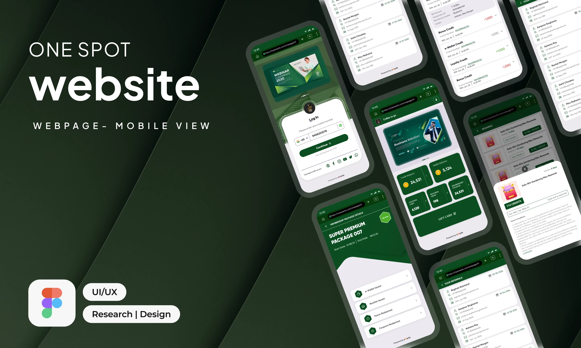
One-Spot Web App
A lightweight, brand-adaptive mobile web experience for loyalty, rewards and engagement.
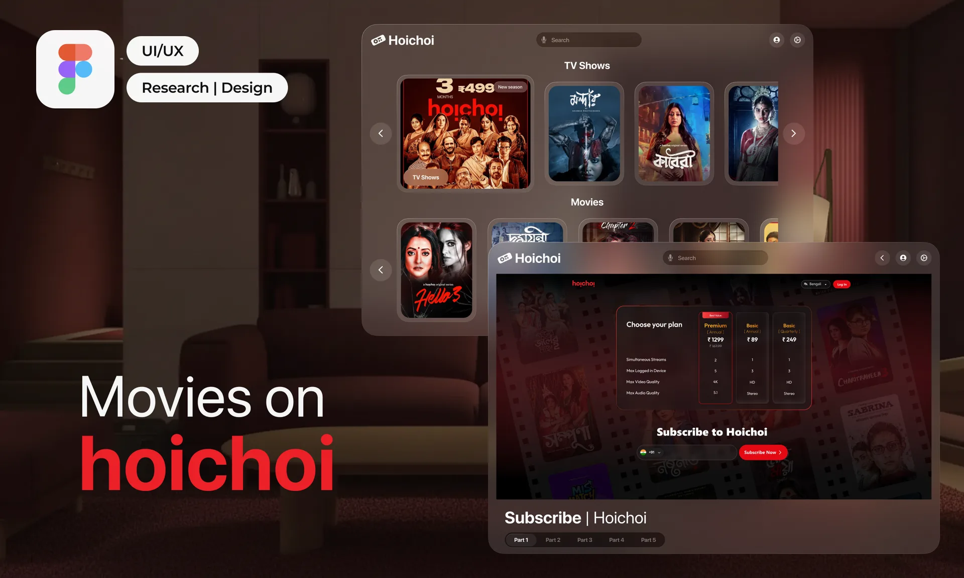
hoichoi, Rethought
Improving discovery, clarity and decision-making across the OTT subscription journey.
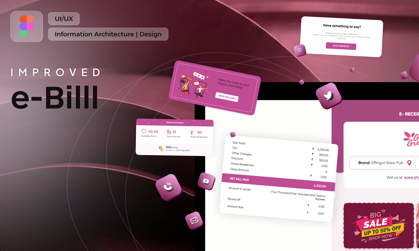
e-Bill, Improved
A tax document rebuilt into the post-purchase screen brands actually wanted to own.
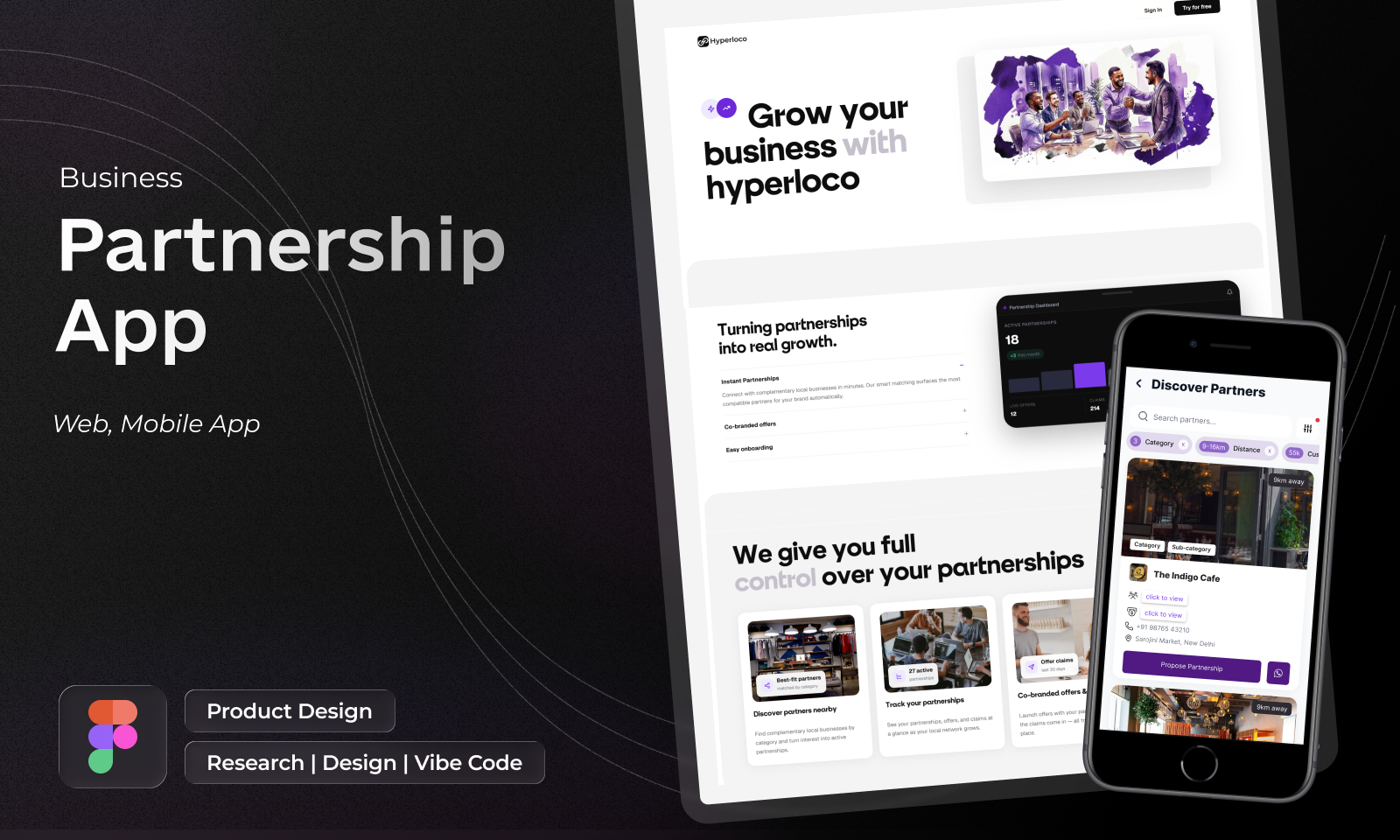
Hyperlocal Network
Neighbourhood businesses trading customers with each other, designed for a cold start.