UX research & redesign · 2023 · Kolkata
hoichoi had the audience.The subscription flow was losing them.
A two-week research sprint through 200+ public reviews of Bengali streaming’s biggest platform, and a redesign of the three screens that decide whether someone pays: the paywall, the navigation, and the return to play.
Timeline
Two-week sprint
Platform
Smart TV, web, mobile
Audience
B2C · Bengali OTT
My role
Sole researcher & designer
Short collaboration. Every input is public, and every number below is labelled with how it was produced.
People weren’t refusing the price. They were refusing to guess.
hoichoi is the largest streaming platform for Bengali film and series - a catalogue people genuinely want, in a language almost nobody else serves at that scale. That is a rare position, and it means the hard problem is not acquisition. It is conversion.
So I went looking for where the intent to subscribe was breaking. I read every public review I could find from a six-month window and sorted the complaints by what they were actually about. The answer was not that the plans cost too much. It was that the product asked people to commit before it explained what they were committing to, and then went quiet at the exact moments they needed reassurance.
Three screens carried almost all of it. This is what I found, what I changed, and what I would have had to measure to know I was right.
200+ reviews read across the app stores and community threads, then benchmarked against the four services people kept measuring hoichoi against.
Where this goes
Three screens carried almost all of it.
One catalogue, three surfaces, and a single screen that decides the business.
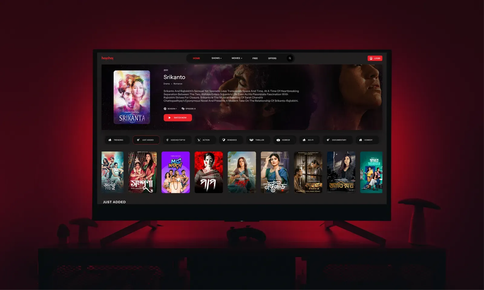
hoichoi ships to smart TVs, web and mobile, with a library built around originals people come specifically for. Everything in the product funnels toward one moment - the paywall - and everything after it depends on the account feeling like it grew rather than reset.
Where it ships

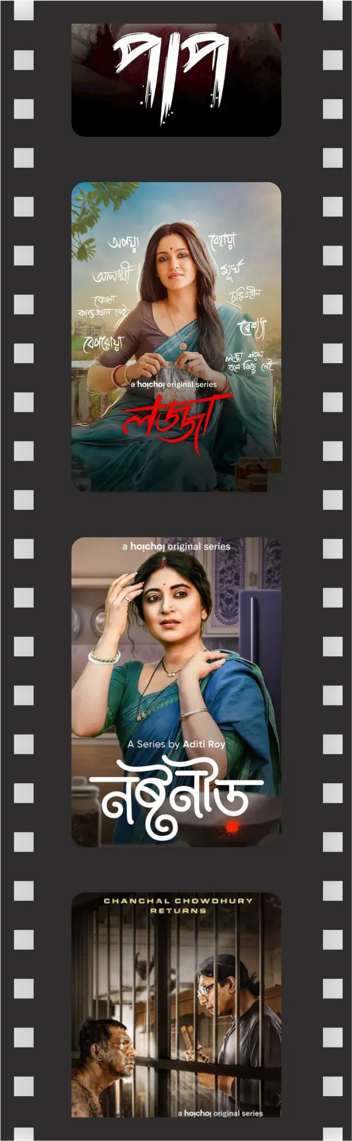

public reviews read and hand-classified across stores, threads and social, from a rolling six-month window.
No user list and no analytics. So I used the people who had already written in.
A two-week engagement doesn’t get a recruiting budget or a funnel dashboard. What it does get is an enormous, unprompted, already-written corpus: app store reviews, community threads and social replies from people who cared enough to complain in public. That sample is biased toward frustration by construction - which is a limitation to state plainly, and also exactly the population a conversion problem lives in.
I read them in a six-month window, tagged each one by what it was really about rather than the feature it named, and kept a separate pile for what people praised on Netflix, Mubi, ZEE5 and SonyLIV - because the comparison set is what sets the expectation.
the review window, read start to finish so one bad week couldn’t skew it. Pulled from the App Store, Play Store, community threads and social replies.
 Sayantika GoswamiPlay Store
Subscription didn't activate instantly. I paid for the yearly plan, but it took several hours to reflect in the app. Customer support was slow to respond.
 Mahima RoyPlay Store
I can't watch the series/movies from the point I left off when I go back to it later. It will start from the beginning. So annoying!
I don't understand why a streaming app in 2025 still doesn't offer a download feature. This is a basic expectation for users now.
 Mainak GhoshSmart TV
The TV interface feels outdated. Scrolling horizontally for everything is painful, and episode thumbnails don't show proper previews.
Sayantika GoswamiPlay StoreSubscription didn't activate instantly. I paid for the yearly plan, but it took several hours to reflect in the app. Customer support was slow to respond.
Mahima RoyPlay StoreI can't watch the series/movies from the point I left off when I go back to it later. It will start from the beginning. So annoying!
I don't understand why a streaming app in 2025 still doesn't offer a download feature. This is a basic expectation for users now.
Mainak GhoshSmart TVThe TV interface feels outdated. Scrolling horizontally for everything is painful, and episode thumbnails don't show proper previews.
 ka40ab · 2 months agoGood Neighbor
I added a bunch of shows to my Favourites tab thinking I could come back to them later, but after subscribing, they just disappeared. I literally can't find any of them.
The whole app feels overcrowded. Every screen is packed with banners, rows, random sections… it's like the app is shouting at me from every direction.
Why should I pay when I can't tell what I get that I don't already have?
Spending more time searching for things than actually watching anything.
ka40ab · 2 months agoGood NeighborI added a bunch of shows to my Favourites tab thinking I could come back to them later, but after subscribing, they just disappeared. I literally can't find any of them.
The whole app feels overcrowded. Every screen is packed with banners, rows, random sections… it's like the app is shouting at me from every direction.
Why should I pay when I can't tell what I get that I don't already have?
Spending more time searching for things than actually watching anything.
What I was reading for
The complaint under the complaint
“Too expensive” and “I can’t tell what I get” look the same in a star rating and are opposite problems. I tagged for the second.
Emotional register
Confusion, betrayal and boredom point at different screens. Betrayal clustered hard around the moments right after payment.
Competitor praise
What people volunteered that rivals do well - downloads, resume, a legible paywall - is the expectation hoichoi is being graded against.
Repetition over intensity
One furious review is an anecdote. The same mild sentence forty times is a design defect. I weighted by frequency, not heat.
Four findings, and only one of them was about money.
Sorted by how often they appeared and how directly they sat on the path to paying.
At a glance
- 1Unreadable plan
- 2No downloads
- 3No emotional case
- 4Buried navigation

The plan was unreadable before you bought it
Tiers were described, not compared. Nothing on the screen told you which one you were supposed to pick, or what actually changed if you paid more.
No downloads, on a mobile-first market
Commuters, patchy networks and travel make offline viewing table stakes in India. Its absence read as the product not knowing its own audience.

No reason to upgrade that landed emotionally
The paywall argued in features. People decide on access to a specific thing they already want - and the catalogue never got to make that case.

Navigation buried the reason to pay
Rails, banners and duplicated sections meant premium content was hard to find. You cannot sell what the interface hides.
Where the frustration actually pointed.
Every review was placed in exactly one bucket by what it was mainly about. The split is the whole argument for spending the sprint on the paywall rather than on the player.
How to read this: these are proportions of a hand-classified sample of self-selected public reviews, not platform analytics. They describe what people chose to write about - useful for pointing a sprint, not for sizing a market.
Confusion about what a plan actually buys
0%Pricing, tiers, and what changes when you pay
Friction in the app itself
0%Navigation, playback state, missing downloads
Satisfied with subscribing as it stands
0%Mostly long-tenure viewers already past the wall
The hypothesis
People don’t subscribe because the product never makes the case before it asks for the commitment.
If that’s true, the fix isn’t a discount or a louder banner. It’s moving the argument earlier, making the comparison legible, and never letting the moment after payment go silent.
Start with the screen that asks for money before it earns it.
The shipped flow put a phone-number wall in front of pricing, so the decision to evaluate and the decision to identify yourself arrived at the same instant. Two commitments, one screen, and the cheaper of the two is the one people abandon. Switch between them.
of reviews cited pricing or plan confusion - the reason this screen came first.
Log in to continue
Enter your number to see plans and pricing.
Plans, prices and what changes when you pay - all on the next screen.
The redesign
Three changes, in the order they affect the decision.
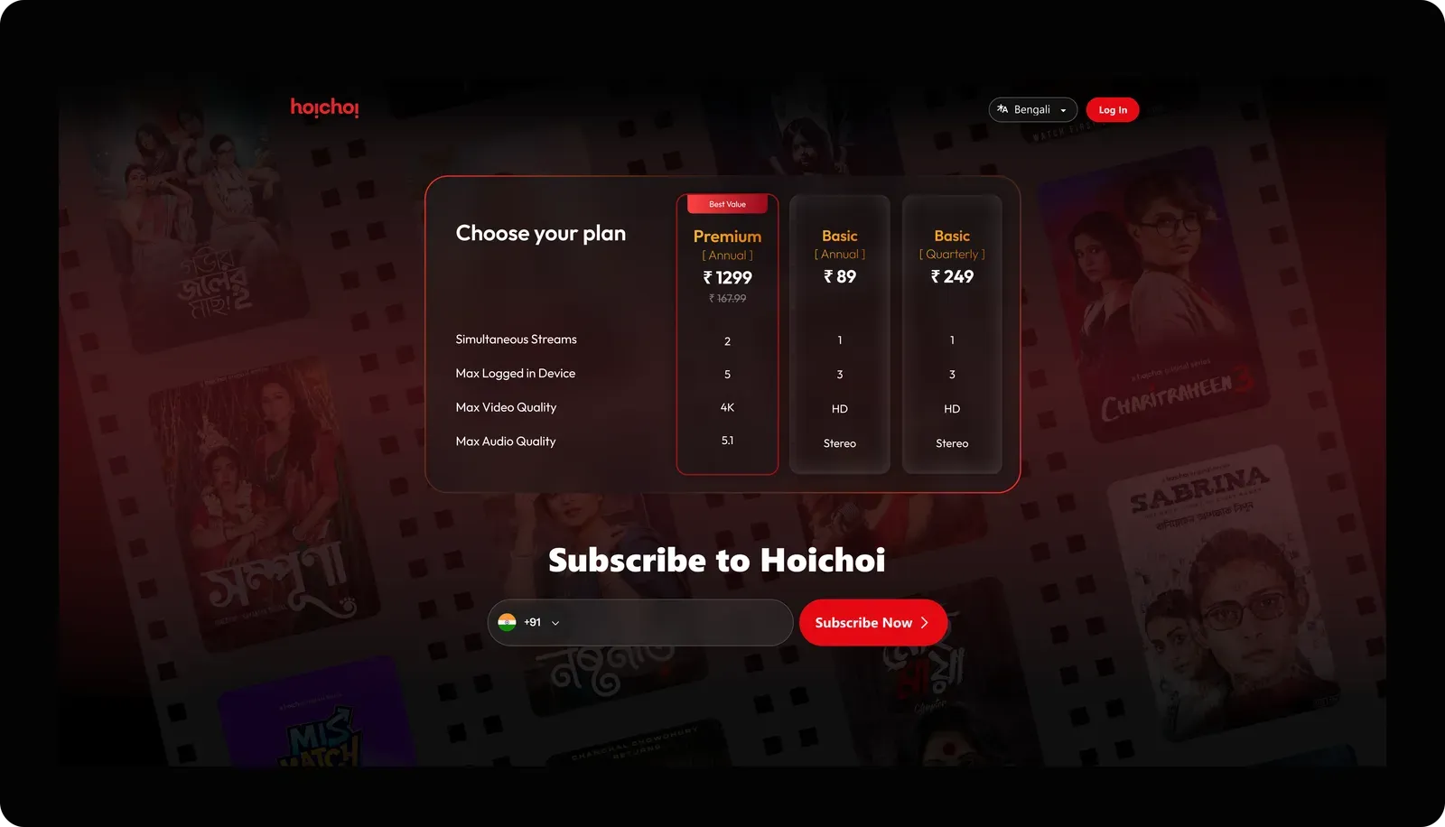
Put the plan in front of the login, and compare tiers on one axis.
Pricing renders for signed-out visitors, and the three tiers become rows of the same matrix - streams, devices, quality, audio - so the differences can be read across rather than reconstructed from three separate cards. The recommended tier is marked outright. Identity is collected on the next step, once there is something worth signing in for.
Trade the top header for a side rail that can hold everything people were hunting for.
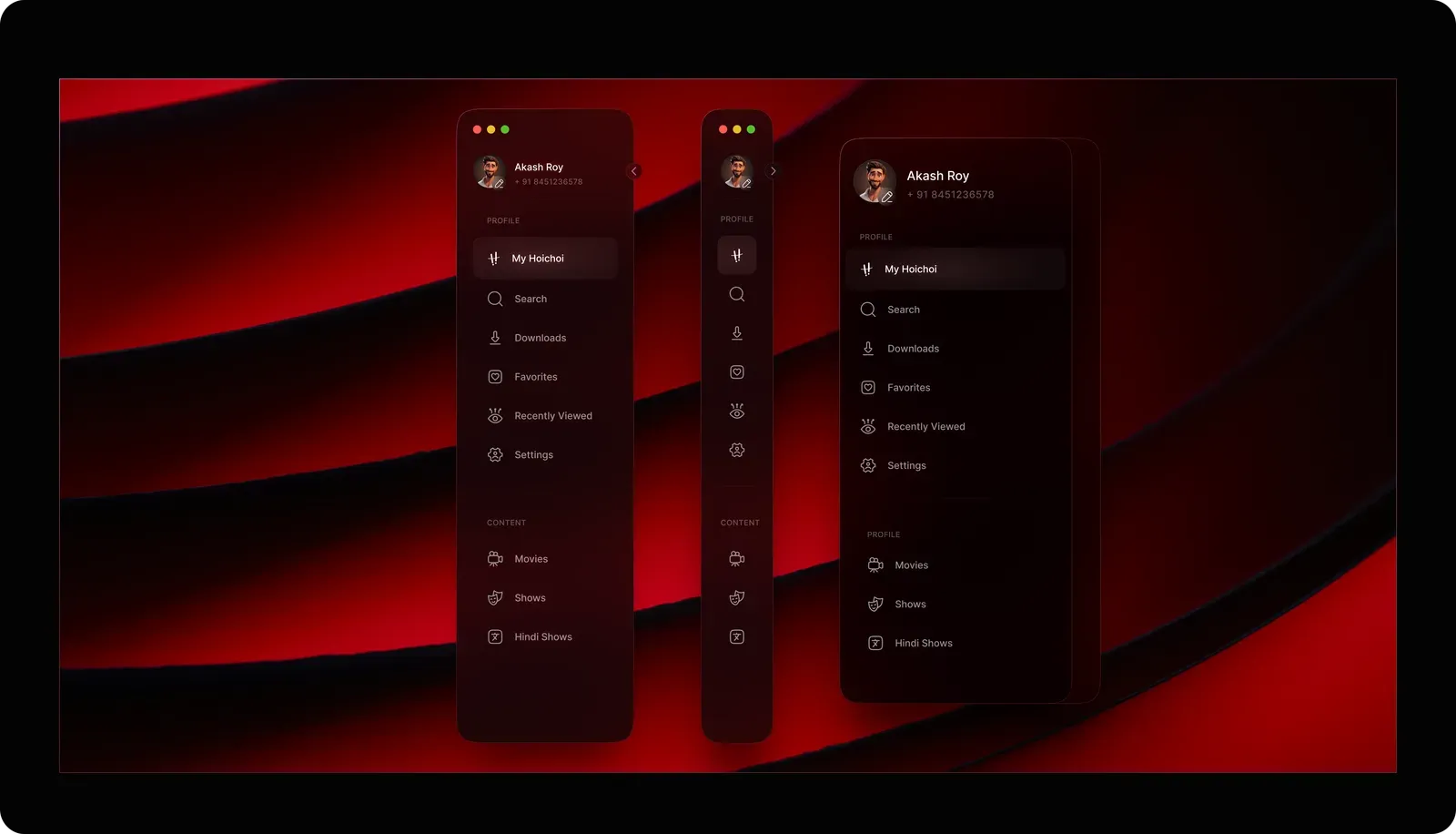
A horizontal header runs out of room at exactly the point a catalogue gets interesting, which is why sections were being duplicated into rails and banners. A collapsible side navigation scales vertically, keeps its labels, and gives the three things reviews kept asking for - Downloads, Hindi-dubbed content, and a real Recently Viewed - permanent, findable homes.
Let the catalogue make the argument the paywall couldn’t.
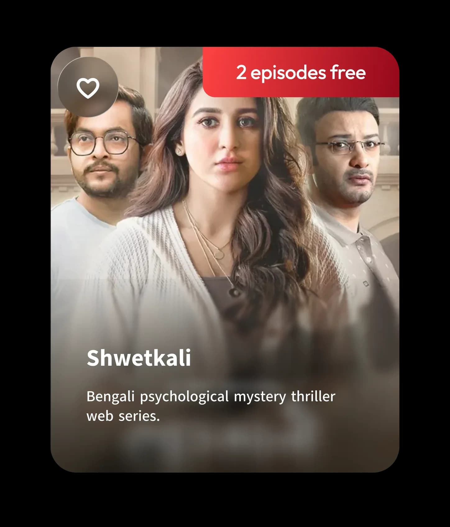
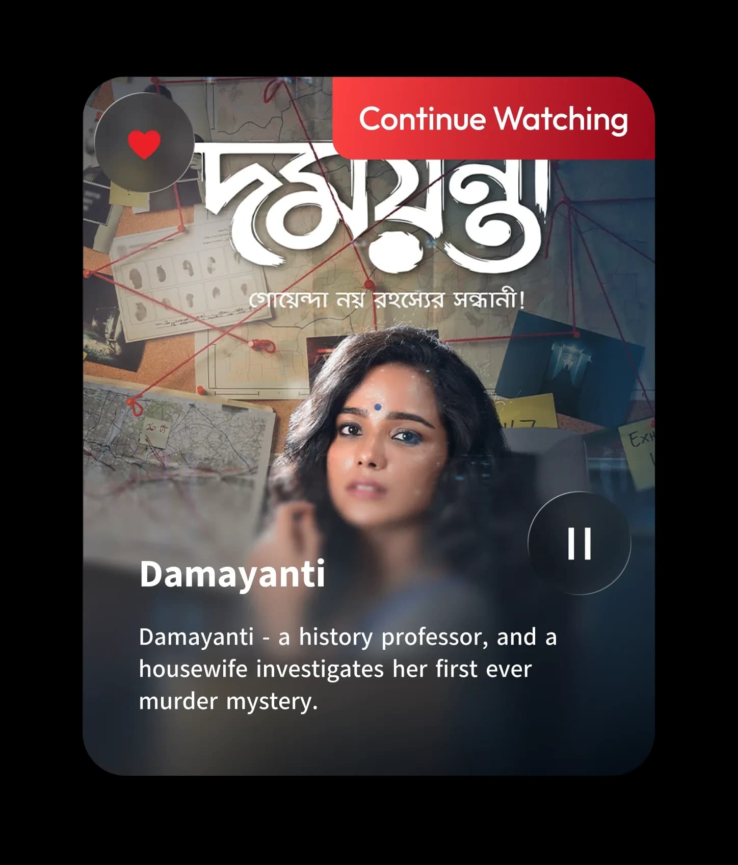
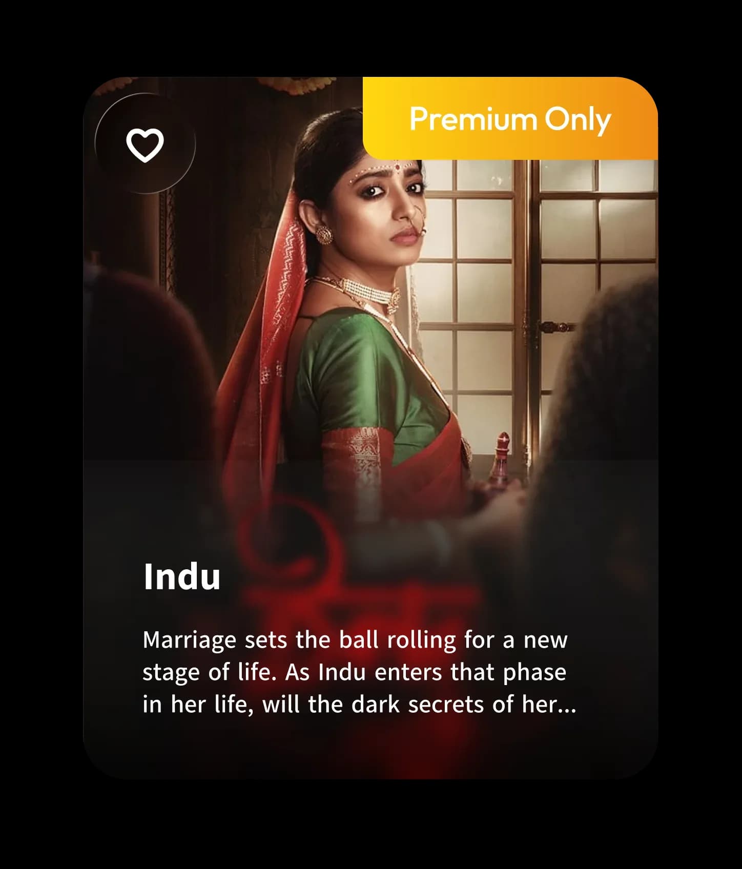
A tier list is a poor salesperson. A specific show you have already started is a good one. Cards carry an honest free allowance, a visible progress state, and a one-line reason the title exists - so the upgrade prompt arrives attached to something the viewer already wants, at the moment they hit its edge.
Go from curious to paid. Here’s how it should read.
The five steps the redesign is actually arguing for, in order. Each one exists because something in the review set said it was missing.
In this order
- 1See the plan before the login wall
- 2Compare tiers on one screen
- 3Pay without leaving the context
- 4Access confirms itself
- 5Return to the exact frame you left
Premium is active
4K unlocked · 5 devices · Downloads on
Designer’s memo
The most useful thing I did in this sprint was resist the first answer. Every second review says some version of “too expensive,” and it is very tempting to hand that to pricing and walk away.
But reading two hundred of them in a row changes what the sentence means. People weren’t comparing ₹1299 to their wallet. They were comparing it to a blank - they genuinely could not tell what the money bought, so any number felt like too much. That is not a pricing problem wearing a design costume. It is a design problem wearing a pricing costume, and the two have completely different fixes.
The other thing I’d keep: the complaints that hurt most weren’t about missing features. They were about the product going quiet - after a payment, after a session, after adding something to a list. People will forgive a small catalogue. They don’t forgive being made to feel like they did something wrong.
Poulami Patra
Researcher and designer on this study
— The end —
More case studies
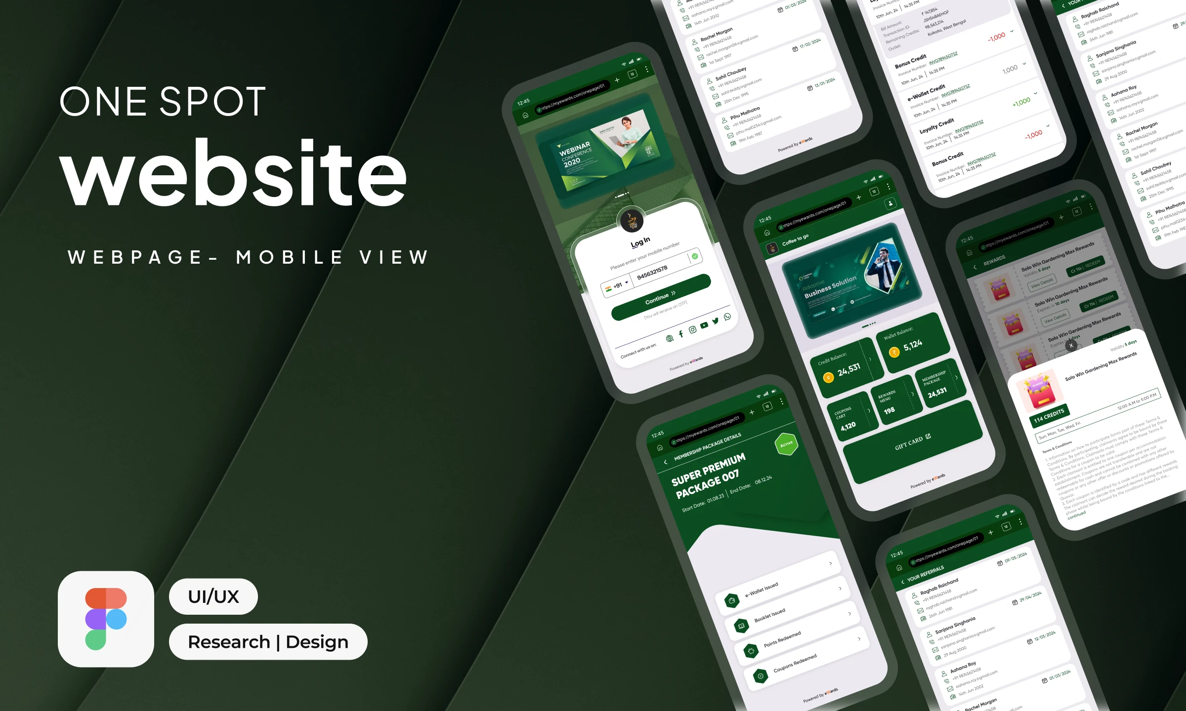
One-Spot Web App
A lightweight, brand-adaptive mobile web experience for loyalty, rewards and engagement.
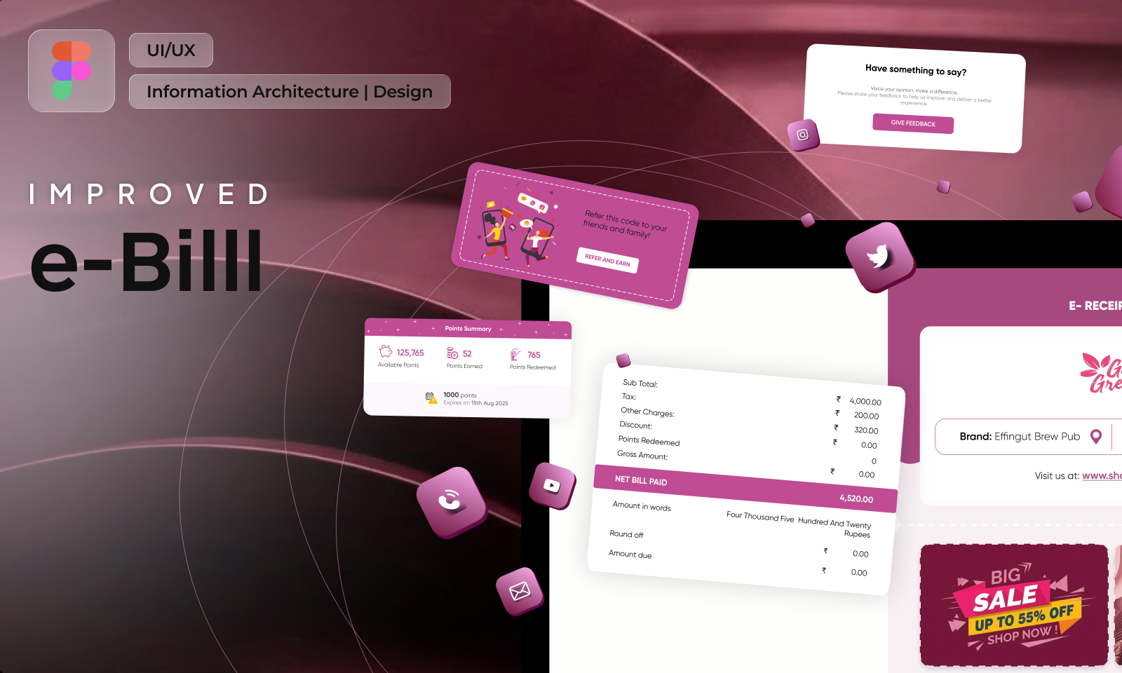
e-Bill, Improved
A tax document rebuilt into the post-purchase screen brands actually wanted to own.
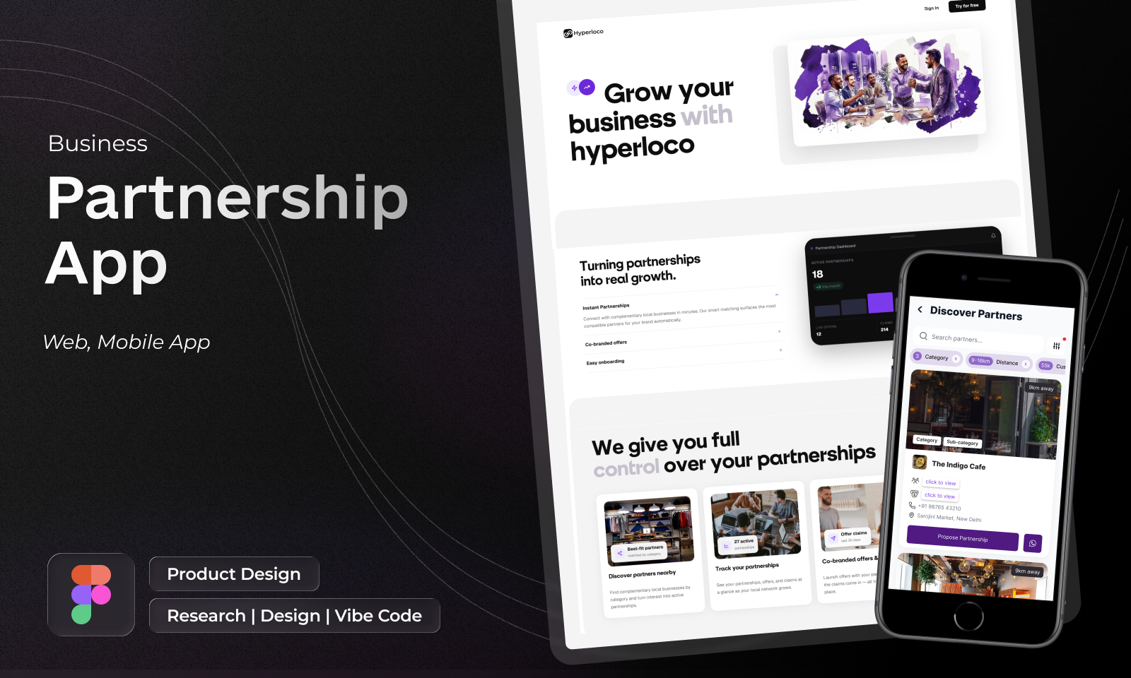
Hyperlocal Network
Neighbourhood businesses trading customers with each other, designed for a cold start.
The eWards Design Guide
One vocabulary for colour, type, space and state - shared across Vue and Flutter.